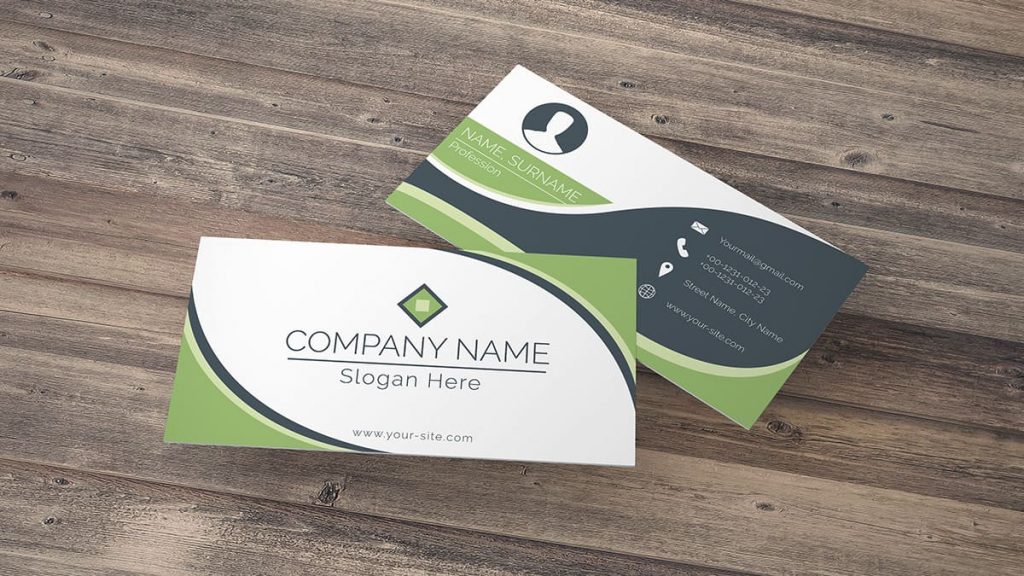
The concept of something or the other being good is a rather vague thing for anyone to think about, since there is a pretty good chance that your opinions on what is good and what isn’t will vary based on a wide range of factors such as personal preference among other things. That said, when it comes to business card design, suffice it to say that there are a few standard practices that you can rely on which help make this question decidedly more objective even if you are really strict in your adherences to the norm or alternatively if you generally prefer things that are out of the box in their origin.
If you want to know what makes a good design for Metal Kards, the first place that you should start is the step that involves adding fundamental elements to it. This is because of the fact that these fundamental elements will form the core that you can base your various other design choices on, and the truth of the situation is that this core should ideally comprise your logo, contact details as well as your own legal name.
The fact of the matter is that this is just where good business card design starts rather than where it ends, and you should add a few more things to make the design at least somewhat more compelling. Images and splashes of color can work wonders for your business cards and you would be amazed at how much more they will pop out when you begin incorporating such elements into them. This just goes to show that good design does not necessarily mean using complex design techniques.


